
Displaying a collection of artwork with a loose, purposefully imperfect impulse dates back to the 16th century, when collectors would construct “cabinets of curiosities” to display their pieces. Often stretching from floor to ceiling, these epic displays communicated their owners’ wealth, knowledge, taste, and power. Looking to display yours? 😉 Consider these design tips.
CURATE A COLLECTION
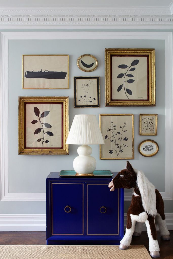
Photo: David Land, Courtesy of The Finer Things
If you’re feeling overwhelmed by the thought of an eclectic grouping, consider sticking to one style of artwork. Highlighting a single artist or medium will ensure that your assortment feels cohesive. In the Spades’ home, a sharp grouping of Hugo Guinness prints feels balanced and clean, yet the diversity of shapes and icons provides levity.
GO LOW, GO HIGH
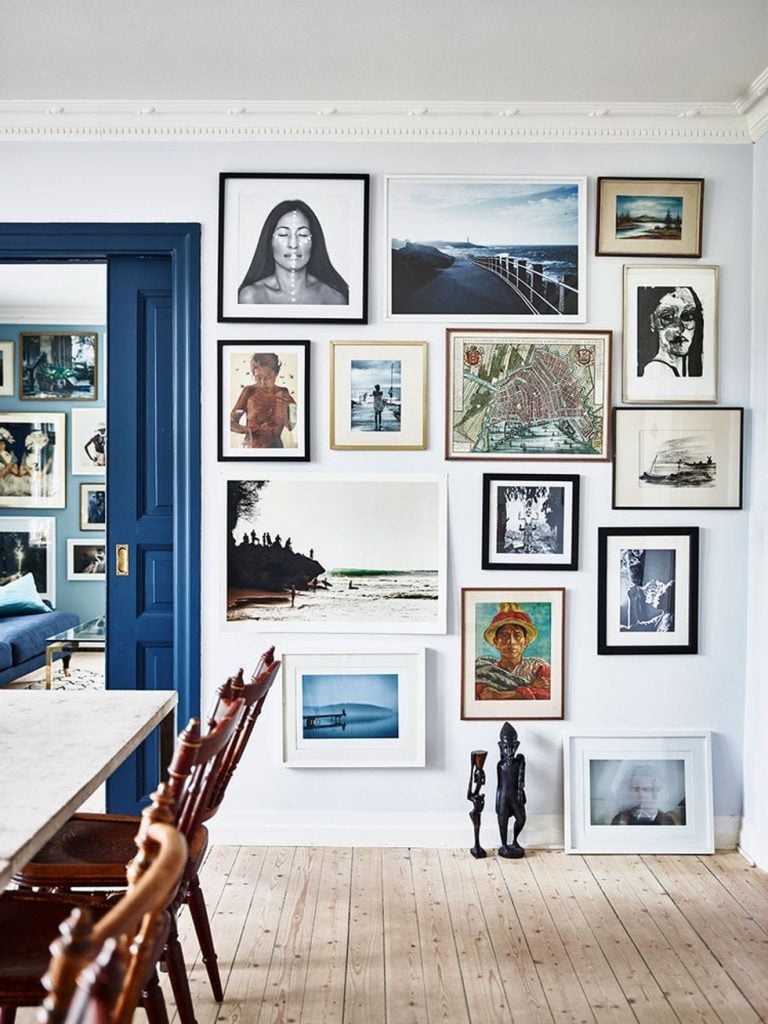
Photo: Andrea Papini, Courtesy of domino
We’re conditioned to believe that we should should hang art at eye level (generally 57″ at the center of the piece). However, some of the most intriguing salon walls begin just above the floor (or even, as pictured above, on the floor!). Don’t be shy; your collection can sit just below the crown molding.
MIX AND MATCH
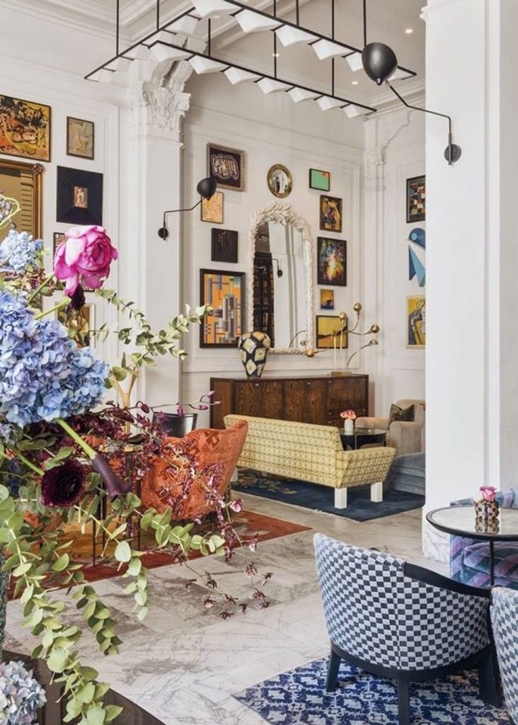
Courtesy of San Francisco Proper Hotel
According to Austin-based interior designer Maureen Stevens, a layered look calls for mixing and matching different materials. “Do not be afraid to mix different wood tones or design styles but…edit, edit, edit. Mix and match 3-5 design styles. How about Victorian Mid-Century Modern? Baroque and ornate frames will be lovely with burl wood frames; Industrial vintage calls for rustic wood frames mixed with black metal. Another tip? Do not just limit your wall to photos or art; hang mementos, objet trouvés from trips, and other amazing finds.”
ADD DIMENSION
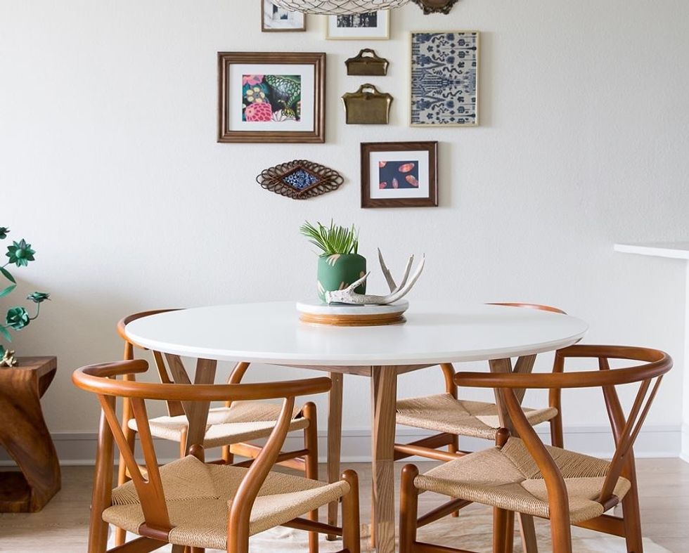
Courtesy of Maureen Stevens Design
Consider incorporating some elements that protrude from the wall for a more bohemian, collected look.
OPT FOR SHELVES INSTEAD
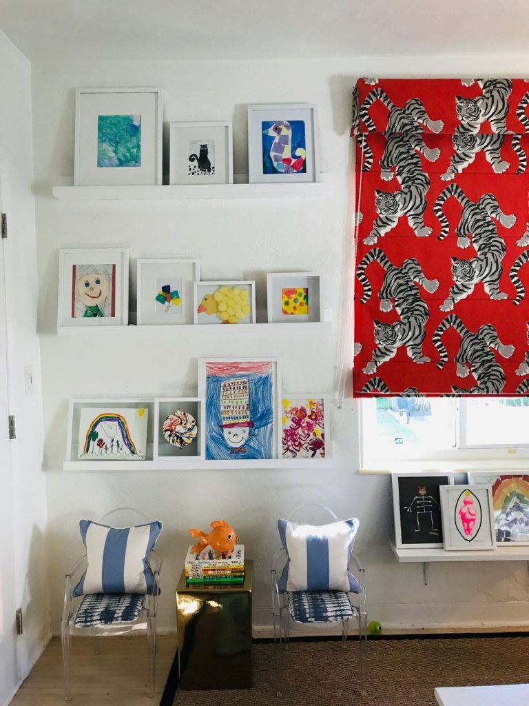
Courtesy of @theroyalcarron
Looking for a less-permanent installation? Miami-based interior designer Malachy Carron recommends shelving: “I use picture shelves and stack the photos and artworks in the same style frame in an array of sizes. In my kids rooms, I use six long picture shelves with a bunch of their framed school art.”
SPACE IT OUT
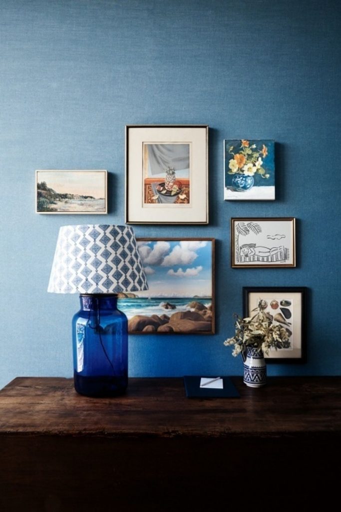
Courtesy of Vogue Living
Interior Designer Maureen Stevens also suggests keeping the collection tightly spaced. “Less room between pieces works best! 3-6 inches is the golden rule. A curated wall is all about cohesion and how each piece relate to one another; if they are closer then they communicate with each other more.”
MAKE A MAP
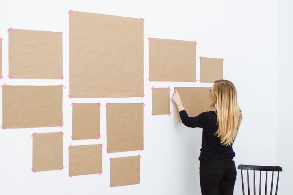
Courtesy of I’ve Been Framed
Once you’ve chosen your look, be sure to map it out. Most design pros will instruct you to lay out your collection on the floor before hammering a single nail. Start by laying out a large roll of paper. Then, arrange, rearrange, and rearrange again. Once you’ve landed on a collage that you love, trace each piece onto the paper. Transfer the paper map to the wall and start hammering.